
Spokane, WA – Cravens Coffee, a long-standing institution in the Spokane coffee scene since its inception in 1993, has launched a comprehensive brand identity refresh, prominently featuring new packaging designs that underscore the company’s deep-rooted commitment to quality, ethical sourcing, and the intricate journey from farm to cup. Developed in collaboration with the creative firm Sally Morrow Creative (SMC), this initiative aims to modernize the brand’s visual presentation while reinforcing the core values that have defined Cravens Coffee for over three decades. The redesign extends beyond packaging to encompass a redesigned retail merchandising system, ensuring a cohesive brand experience across all consumer touchpoints.
A Legacy Reimagined: The Design Philosophy
The "Design Details" feature in Daily Coffee News often explores innovative approaches to coffee shop architecture, interior design, packaging, and branding. In this instance, the focus is on how Cravens Coffee and Sally Morrow Creative have navigated the delicate balance between celebrating a rich heritage and embracing contemporary aesthetics. The new packaging, a cornerstone of this refresh, moves away from abstract storytelling, instead grounding its narrative in the tangible realities of coffee cultivation and production. This approach aims to resonate with a growing segment of consumers who are increasingly interested in the provenance of their coffee and the ethical considerations involved in its sourcing.
Sally Morrow, Creative Director and Principal at SMC, articulated the driving force behind the redesign. "Cravens has an incredible story – one grounded in relationships and high quality," Morrow stated in a project description shared with Daily Coffee News. "Our job was to elevate those strengths through design that tells their story in a modern, visually engaging way." This philosophy is evident in the visual language employed, which eschews overly complex or metaphorical imagery for a more direct and evocative representation of the coffee’s origins.
Visualizing the Journey: Packaging Design
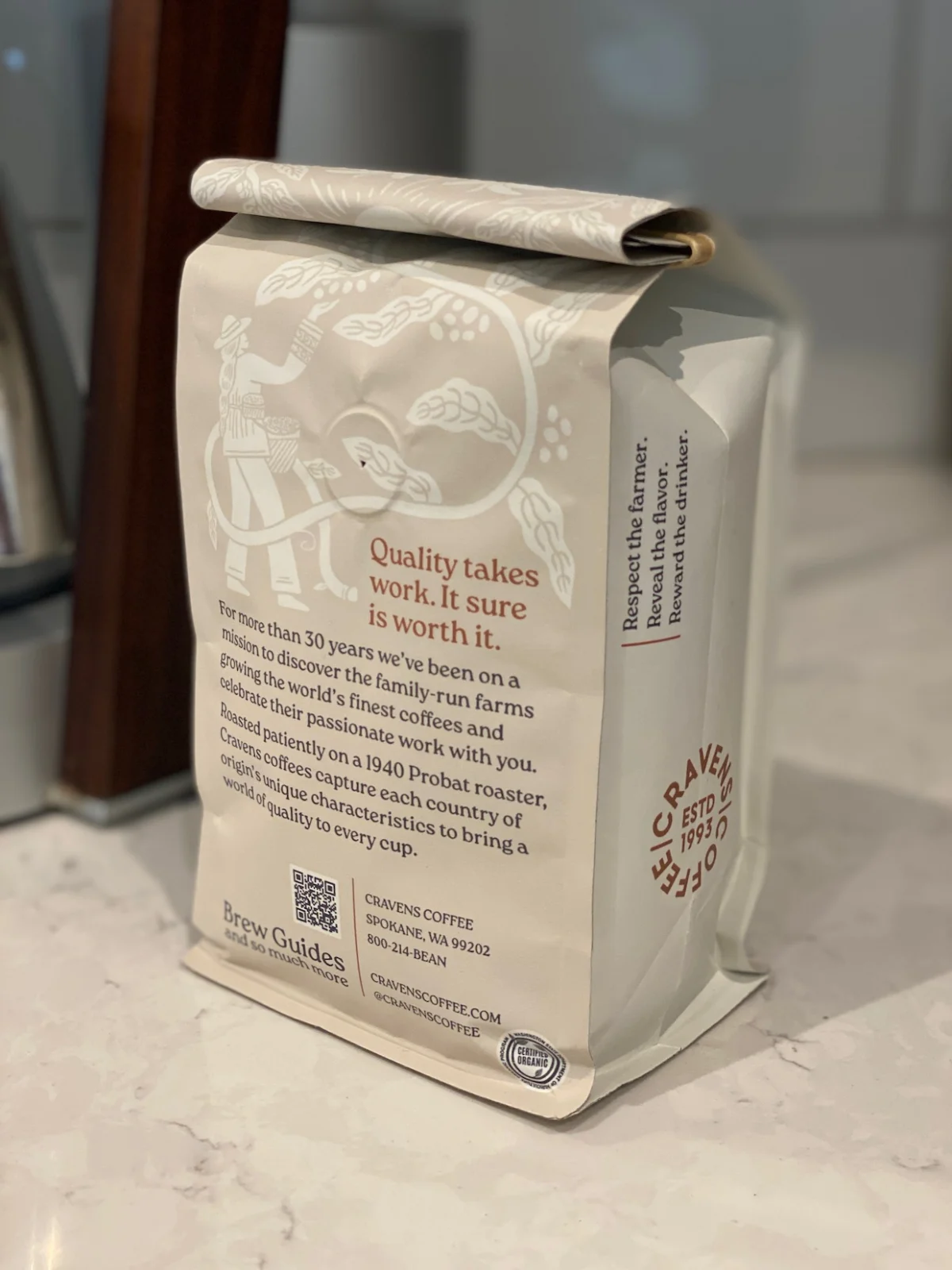
The new Cravens Coffee bags are characterized by a sophisticated tone-on-tone illustration style, rendered in a warm, muted color palette. This subtle yet impactful design choice creates a sense of understated elegance. A recurring motif of repeating figures and botanical forms—including coffee leaves, fruit, and scenes of coffee picking—weaves a narrative tapestry across the packaging. These visual cues are directly tied to the origin, agriculture, and the labor involved in coffee farming, providing a direct link to the source of the beans.
SMC developed custom illustrations specifically to "highlight the farmers, plants and environments where Cravens’ beans are grown," as detailed in the design description. This deliberate choice serves to reinforce Cravens Coffee’s long-standing emphasis on establishing and nurturing enduring sourcing relationships with coffee producers. By visually spotlighting the individuals and landscapes involved in coffee cultivation, the brand aims to foster a deeper appreciation for the human element and the dedication required to produce high-quality coffee.
The packaging also incorporates concise, impactful text callouts that further articulate the brand’s ethos. Phrases such as "Quality takes work. It sure is worth it." and "Respect the farmer. Reveal the flavor. Reward the drinker." are strategically placed to communicate the brand’s commitment to excellence, ethical practices, and the ultimate enjoyment of the coffee by the consumer. These taglines are not merely descriptive; they are intended to evoke a sense of shared value and appreciation between the brand and its customers.
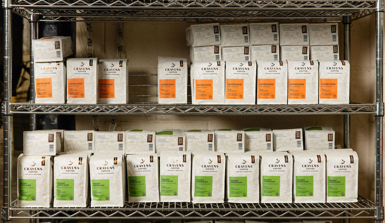
On retail shelves, the packaging adopts a distinctive visual strategy utilizing crisp, rectangular color blocks set against a light background. This design element creates a strong "billboard" effect, enabling different blends, single-origin offerings, and seasonal releases to be easily distinguished. This clarity in visual hierarchy is crucial for consumer navigation in a competitive retail environment, ensuring that product identification is swift and intuitive. The impact of this design choice on sales can be significant, as visually appealing and clearly differentiated products are more likely to capture consumer attention and drive purchasing decisions. Studies have consistently shown that effective packaging design can increase brand recognition and influence consumer perception of product quality.
Extending the Narrative: Retail Merchandising
The brand identity refresh extends beyond the coffee bags themselves, permeating the physical retail environment. Cravens Coffee and SMC have collaborated on a redesigned grocery kiosk, where the brand’s new copper-toned header panel, featuring the updated Cravens logo, serves as a prominent anchor. This visual element is designed to immediately convey the brand’s updated aesthetic and establish a strong presence within the retail space.
The merchandising system itself is modular, engineered to support a variety of buying formats. This includes bulk bins with color-coded product labels, facilitating easy identification and selection for consumers who prefer to purchase by weight. Directly below, rows of bagged coffee maintain the cohesive packaging design. The fixture also integrates essential equipment and storage solutions, ensuring operational efficiency and a streamlined customer experience.

"Every element was designed to tell a story," Morrow emphasized. "From farmer to roaster to customer, we wanted the brand to reflect the people and relationships behind every bag." This holistic approach to branding ensures that the narrative of quality and connection is consistently communicated across all consumer interactions, from the initial visual encounter with the packaging to the in-store display and ultimately, the enjoyment of the coffee itself.
Context and Chronology: Cravens Coffee’s Evolution
Founded in 1993, Cravens Coffee has cultivated a reputation in Spokane for its dedication to sourcing and roasting high-quality coffee beans. Over the past three decades, the company has witnessed significant shifts in the coffee industry, including a growing consumer demand for transparency in sourcing, an increased awareness of sustainability practices, and a sophisticated appreciation for the nuances of coffee flavor profiles. This brand refresh can be seen as a strategic response to these evolving market dynamics.
The decision to undertake a complete brand identity overhaul likely stems from a desire to remain relevant and competitive in a landscape where consumer preferences and industry standards are constantly evolving. The partnership with Sally Morrow Creative, known for its expertise in brand strategy and visual design, suggests a deliberate effort to leverage external creative talent to achieve a sophisticated and impactful outcome.
The implementation of this new brand identity, from packaging to retail fixtures, represents a significant investment by Cravens Coffee. This investment signals a long-term commitment to its brand and its customer base. The success of such a refresh can be measured not only by immediate consumer reception but also by its ability to strengthen brand loyalty, attract new customers, and potentially expand market reach.
Broader Implications for the Coffee Industry
The Cravens Coffee brand refresh offers valuable insights into current trends within the specialty coffee sector. The emphasis on origin, farmer relationships, and transparent storytelling aligns with a broader industry movement towards ethical consumption and a deeper understanding of the coffee supply chain. As consumers become more discerning, brands that can effectively communicate their commitment to quality, sustainability, and fair labor practices are likely to gain a competitive advantage.

The success of this redesign could influence other coffee roasters and retailers to re-evaluate their own brand identities. The approach taken by Cravens Coffee and SMC—grounding abstract concepts in tangible visual narratives and reinforcing them through consistent in-store experiences—provides a compelling model for brands seeking to connect with consumers on a more meaningful level. In an era where authenticity and purpose are increasingly valued, such a comprehensive and thoughtfully executed brand strategy is not just beneficial; it is becoming essential for sustained growth and market leadership.
The ongoing "Design Details" series aims to highlight exemplary projects that push the boundaries of coffee-related design. The Cravens Coffee redesign, with its clear articulation of values through sophisticated aesthetics and strategic storytelling, is a notable contribution to this ongoing dialogue within the coffee industry. It underscores the power of design to not only attract attention but also to build deeper connections and communicate the intrinsic value of a product and the principles it represents.
For inquiries or to share news related to the coffee industry, please contact DCN’s editors. To stay updated on the latest developments, subscribe to the DCN newsletter.
